It’s one of my favourite movies of all time. This movie was one of the first ones that made me forget about the real world for a few minutes. Therefore, I decided to create something special for it.
Sketches
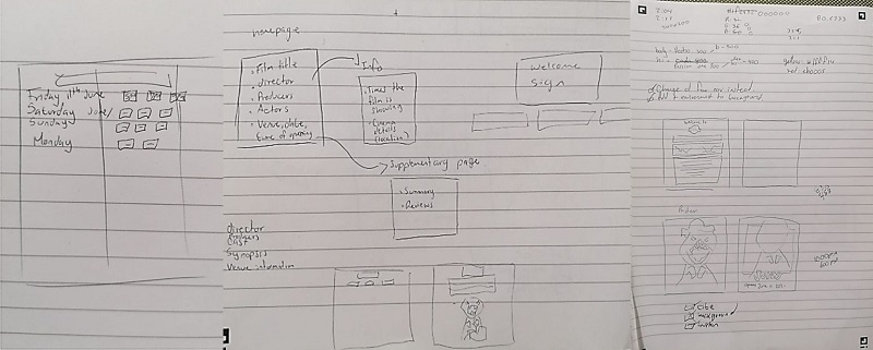
First of all, I did some sketches of what I wanted to show on the different pages, distributing the information to have an idea of the content that would be included on each page. Then, I started designing the homepage layout, the images and the typography I wanted to use.
Typography
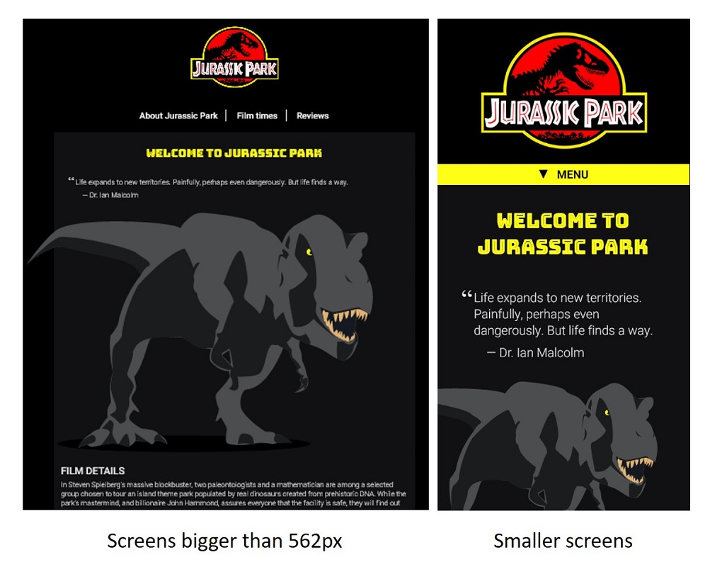
For the H1, I chose “Bungee Inline” because I liked the lines in the middle that the letters had, as it was similar to the ones in the logo. Unfortunately, this wasn’t that noticeable, but I decided to keep it.
Choosing a location
Also, I decided to use Rio Cinema as the local cinema for the film because I worked for an event that was hosted in that place and I liked the environment and the customer service too, so I thought it would be the perfect place to present a great film like this one.
Design
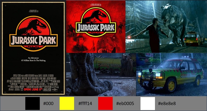
I created a small mood board to understand the colours and elements I wanted to include in the pages. A pattern I noticed while doing the visual research was that the most popular poster was the one that showed the logo on a black background. Also, the T-rex scene attacking the main characters in the car is one of the most popular scenes and my favourite one (I watched the film twice … for research reasons, of course!). From these images, I concluded that yellow, red, and black would be the site’s colours and a 90’s style if possible.
Images
I decided to draw a vector image of the T-rex and the car for the main page and Jurassic Park’s entry as an easter egg for the 404 page. I saved these images in SVG. The car was given a simple animation to move from point A to point B, and then I included animation for the T-rex to fade in when the user entered the home page.
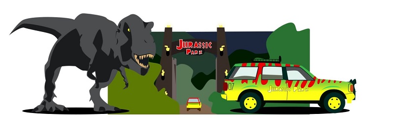
I chose a similar colour palette for the dinosaur and the site as I wanted it to look hidden, as the movie is about running away from the T-rex, not always knowing where it is.
I included a toggle menu for small screen sizes. I thought it would be the perfect moment to try this toggle as it used JQuery which was something that I’d never used before in any of my codes. I enjoyed this part, as I had the opportunity to read it and understand it properly, and seeing it working properly was very nice.
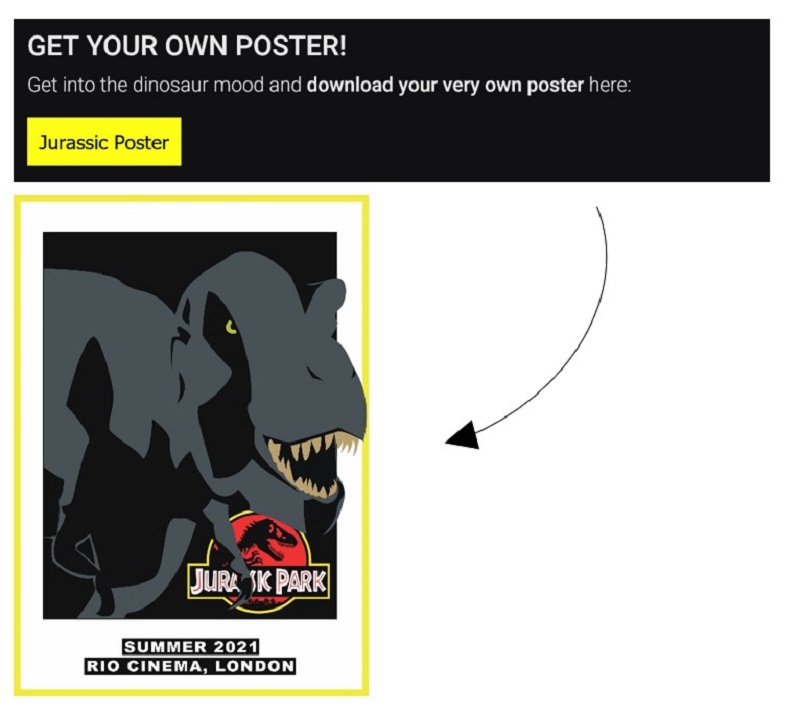
A special treat for Jurassic fans
As a special treat to the users, I included a poster that can be downloaded on one of the pages, and it is ready to print as it is saved in CMYK format, so it can look really nice when printed.
Conclusion
I wanted to include a raining CSS animation in the background as some of the most exciting scenes happened while raining, but I couldn’t find a proper way to do it, as I didn’t feel happy with the way it looked. The background looked too busy, or the animation looked too fake, so I decided that the best decision was to leave the background simple so the illustrations could be the main focus.
I really enjoyed this project; it was nice to re-watch the film and design some fun illustrations to give a more personal touch to the site. This project was a great opportunity to try new things such JQueries and animation in CSS, and I am glad I did it, even though I need to improve these skills.