For this article, I will be covering what is the HTML <details>
element and how is it used as well as if it moves HTML in a new direction.
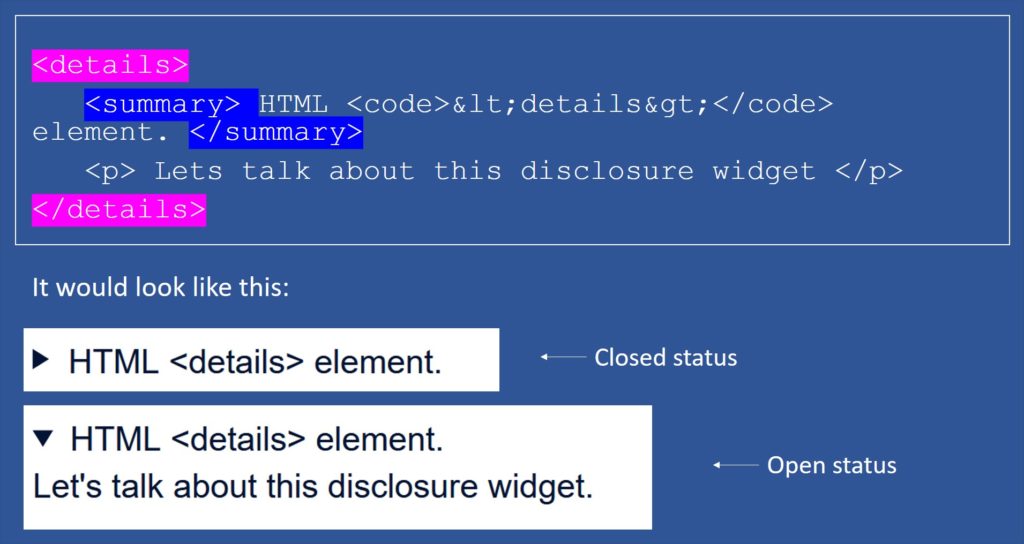
<details> element is a disclosure accordion-like widget. This widget will show information when it is toggled into an open state, meaning that the user can interact with the information displayed on the screen by opening or closing the tag.
This disclosure widget includes a small triangle that rotates to indicate its status (open or closed) followed by a label next to it. This widget can be in one of the two states, but by default, it will show the closed status, displaying only the triangle and the label.
The <summary> element can be used as the first child of the <details> element in order to customize the label, as it is used to specify the caption for the disclosure box of the <details> element. If no <summary> element is added, then some default text will be shown instead, such as “Details”.
Displaying <details> on the browser
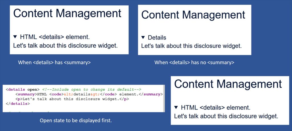
- When the element <summary> is included within the <details> element, then the text that is added to the <summary> element will be displayed as the label of the disclosure widget. As shown in the example above.
- For the second example, we can see that the “Details” word is displayed as the widget label. This happens when no <summary> is added to the <details> element. Therefore the browser will use a default summary string (usually “Details”).
- Another way to display <details> is by adding a boolean open attribute to the <Details> element. When this open attribute is added, the open state will be displayed first instead of the closed state.
Attributes and Events
Open attribute
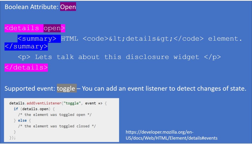
As mentioned before, an attribute that can be used in this element is the Open attribute. This boolean attribute will indicate whether or not the content of the <details> element is visible. By default, the <details> element’s content is hidden unless the user clicks on the label or the triangle. But if we do not want to hide the details, then the open attribute must be added to it.
A boolean attribute is an attribute that can only be true or false. In this case, Open will be equal to false. Also, keep in mind that there is no closed attribute, as it is its default; therefore, when the open attribute is not included, then closed would be automatically implied.
Toggle event
The toggle event is supported by the <details> element. This event is dispatched to the element every time its state changes between open and closed. It will be sent after the state is changed. If the state changes many times before the browser can dispatch the event, then the events will coalesce, and only one will be sent.
As seen in the image above, you can add an event listener for the toggle event in JavaScript to detect when the widget changes its state.
Permitted content
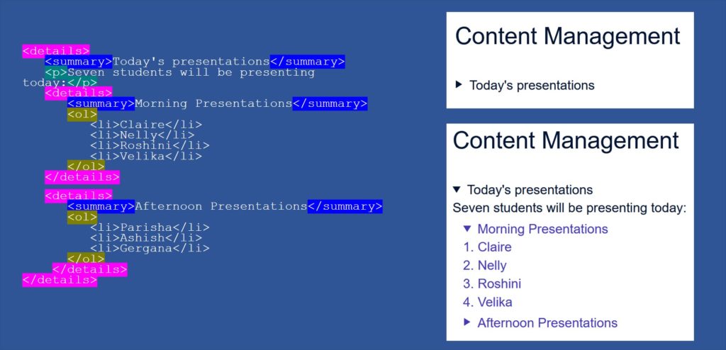
The <details> element’s permitted content is an <summary> element followed by elements belonging to the flow content category. And the permitted content for the <summary> element is phrasing content and heading content such as h2, h3, etc.
Including a heading inside an <summary> element can be an advantage. It will allow the visual style to be consistent and the page structure valid for non-compatible browsers such as IE.
Styling <details> element
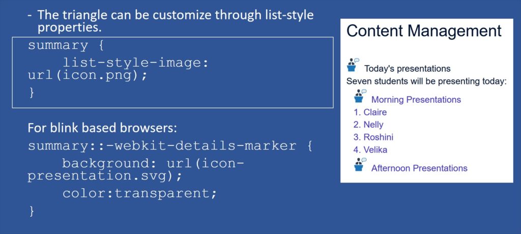
CSS can be used to style this widget. The disclosure triangle can be customised through the list-style properties. Unfortunately, this is not broadly supported, but we can use different approaches until it is.
The image above shows how the list-style-image property can change the triangle for an icon instead. But this is not supported by blink based browsers. Therefore, we can use the ::-webkit-details-marker pseudo-element to apply these changes to those browsers such as Chrome.
Some styling issues to address
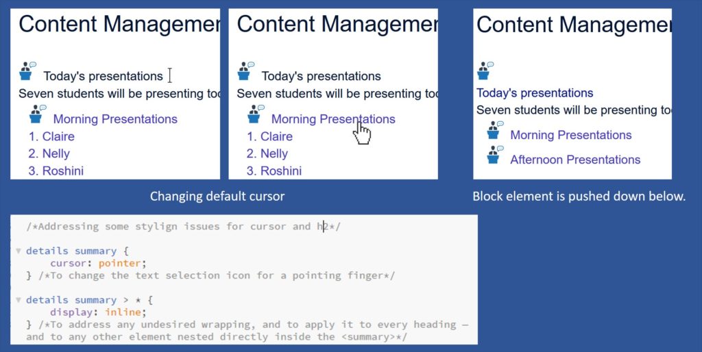
- The first issue you might want to address is the default cursor, as it is a text selection icon rather than the pointing finger. The pointing finger icon is used to show the user that they can interact with that element. Therefore having a text selection icon can be confusing for our users. This issue can be addressed by changing its default cursor to a pointer one.
- The second issue is the undesired wrapping when nesting a block element inside an <summary> element. The heading will be pushed down below the arrow icon instead of beside it (as shown in the image above). In order to correct this you will need to change its display style to inline.
Browser support
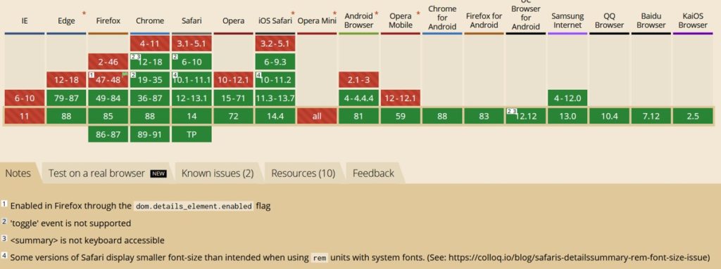
Internet Explorer does not support this element, and Firefox has some difficulties. Some fallbacks via JavaScript can be used for the browsers that don’t support this element. If no fallback wants to be used, ensure that the costume disclosure widget styles are not applied to avoid a situation where our inline styling jumbles the element.
There are different ways to target only the appropriate browsers when resetting styles. One of these methods is to use the @supports feature query to prevent IE from having the styles applies, as IE doesn’t support queries at all so that the styles will be ignored.
Accessibility
We want our users to have access to all our information; therefore, we need to understand how accessible this element is.
<summary> element has the role of a button as a default, removing all the roles from its child element. For example, if we add a <h2> tag to the <summary> element, <h2> will have its role removed and thus will not be treated as a heading for users of assistive technologies such as screen readers.
There are some screen-reading technologies, like Apple’s VoiceOver and NVDA who do acknowledge headings inside a <summary> element, but there are others, such as JAWS, which does not. Therefore, we wouldn’t be able to guarantee that our heading will be interpreted as a heading, making it difficult for screen reader users to follow the information and navigate the page.
Conclusion
Some of the things that <details> can be used include FAQs, toggle comments section of a blog, to show member profiles, for the details of a download, create complex forms, etc.
<details> element move HTML to a new direction. Before <details>, a basic accordion-like widget would require JavaScript event listeners or complicated CSS tricks. For example, before <details>, designers used the “Checkbox Hack” to obtain similar results(https://css-tricks.com/the-checkbox-hack/), this trick consisted of using a connected <level>, <input type=”checkbox”> and other elements that the designer was trying to control. They then hid the checkbox entirely using CSS by setting its opacity to zero or placing it off the page with absolute positioning. Too much work compared to what we do now, thanks to the <details> element.
<details> element can be considered an example of the progress that HTML has been doing for the last few years, and hopefully, it will keep progressing, so some of the things that we do now that take long, one day will be a few lines of HTML and CSS.