For this project I have to create a website for a small local business to promote their services, the main purpose of this website is for customers to visit their shop, so it won’t be an ecommerce website.
Colour scheme
11 November 2020
Included pages
Distribution
2nd December 2020
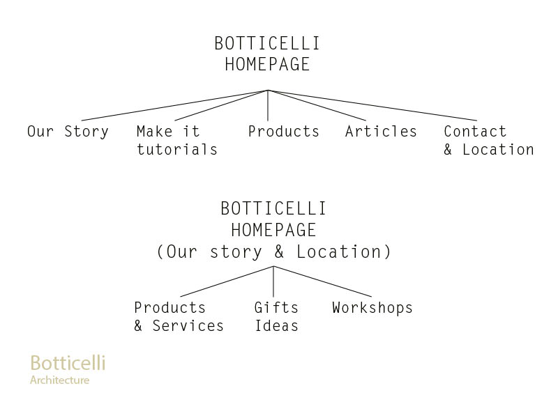
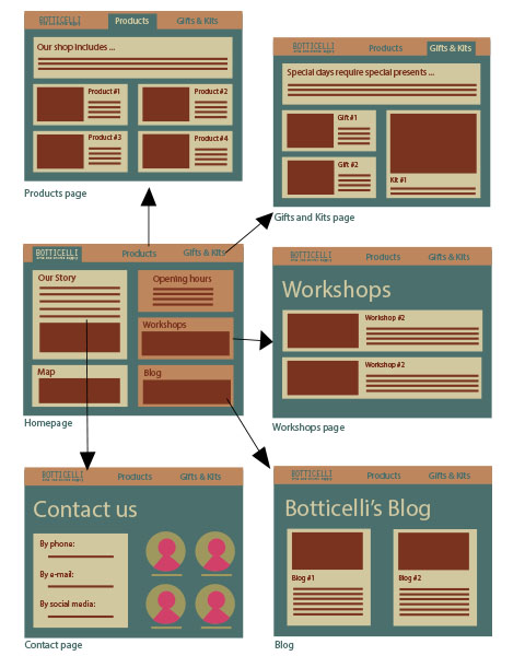
My website will have six pages in total, the menu will have three pages: Homepage, Products and Gifts & Kits; and the Homepage will have links to the other three pages: Contact, Workshops, Blog.
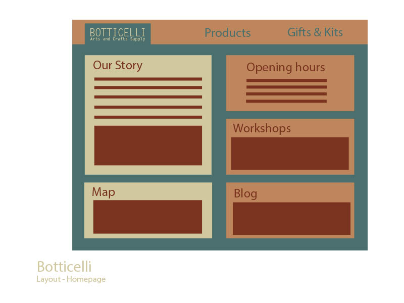
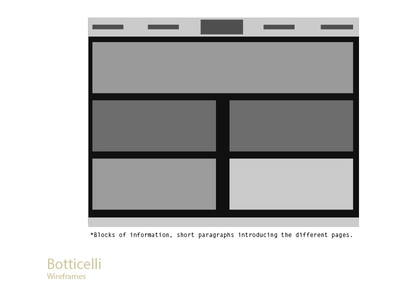
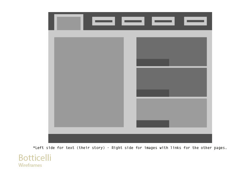
For the Homepage, their story is going to be displayed as the main information with an image of the shop, below that information the user will find the map to locate them easily. Also, on the right, the user can find the Opening hours, Workshops and the Blog. Workshops and Blog will display images instead of words.
This is how the information will be displayed, the Products and Gifts & Kits pages will show price and a short description of the item. For products will be showing single items such as paints, brushes, canvases, notebooks, etc. And for Kits & Gifts I will include a Lino printing kit, a set of paints with brushes, and a set of a sketchbook with colour pencils.
For the Workshop Page I will add at least two workshops, price, date and what it includes will be shown as a short introduction of the workshop. One workshop for lino printing where they could purchase their own kit after the workshop has finished, and another workshop for live drawing, where they could purchase sketchbooks of different sizes, paintings and colours.
For Botticelli’s blog, I was thinking of posting two articles, talking about a featured artist and how to get the most out of the lino printing kit that they are offering in their shop.
The Contact Page will be taken as an opportunity to introduce the team, so the users could see who will receive their feedback or who can help them to answer their questions. I was thinking of adding four team members: one for customer service, one for complains, one for art materials and one for marketing queries.
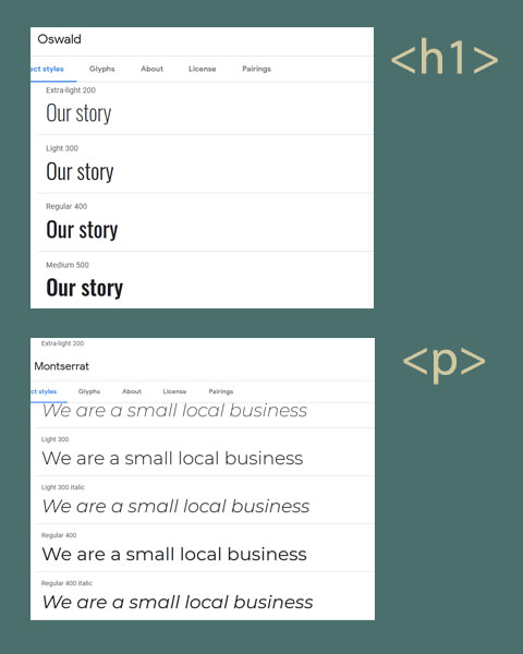
Two of the fonts that I am considering for this project is Oswald-400/500 for the headings and Montserrat 300/400 for the body. I still figuring this out as I am sure that I’ll experiment with more fonts as the project progresses.
Things to consider – based on feedback
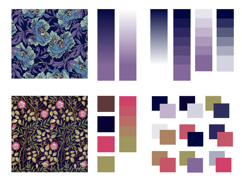
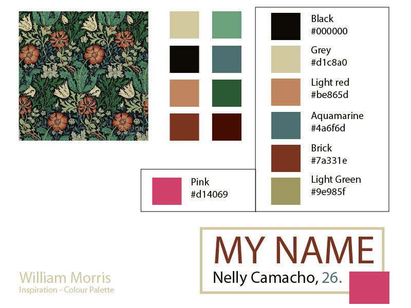
Colours and typography for the website are not defined yet, but this is a good starting point for the project.
Navigation – Add all the links available on the website to the menu (and consider them for the footer too).