There are many websites that I use as point of reference when thinking about web design. Here you can find some examples of the websites I consider of having a good design:
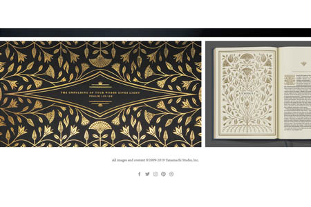
Tanamachi Studio
Tanamachi is a designer and artist who lives in New York City. She has a boutique design studio specializing in custom typography and illustration for editorial, lifestyle, food, and fashion brands. Her client list includes companies such as Google, Yahoo!, Nike, and Waitrose.
I like her website because it is very simple, but it is well structured and is always keeping her artwork as the main point of attention. She has only four pages: two of them are showing her artwork, one is about her and the other one is how to contact her. The background of the website is white because her artwork has already so many vibrant colours that adding more would feel too crowded.
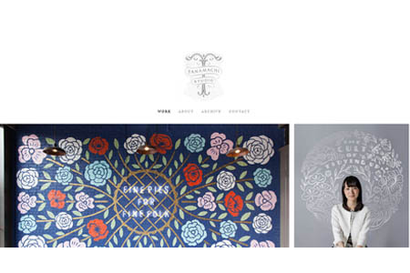
The first thing you will see when you go to her website would be a nice big logo at the top of the page, the four options menu and then the rest of the page would be examples of her artwork. She does not have any pop-ups, cookies, nor subscriptions. Her social media links are at the bottom of the page, meaning that she is confident that her content would draw enough attention for the viewer to continue until the end of her page.
Jessica Hische
Jessica Hische is an author and lettering artist and lives in Oakland, California. Some of her clients include Adobe, Kellogg’s, Harper Collins, and Facebook.
The thing that I enjoy the most about her website is the content and the layout of the pages. When you go to the home page, you can see a short brief of what you will find on her website, such as her last published book, her most recent work, and some images of the products she is selling.
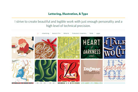
Something I like about her Work page is that she wrote “Lettering, Illustration and Type” as a header and as an introduction so the viewer knows what areas she is covering in her portfolio. Also, she divided her work into six different categories, and if you click any image it will show you some information about it, including clients and a summary of the project.
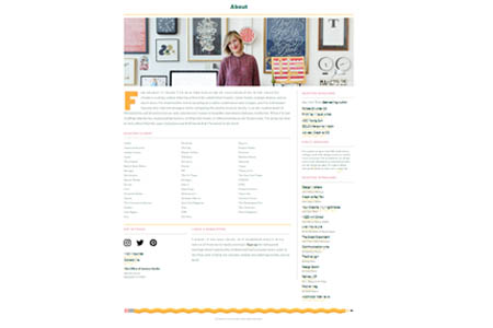
Some other things I think make this page very appealing to me is that her About page looks like a CV, her blog is not a blog is more like a learning journal where you can find useful information and links for designers and her links are not the same as the words shown on the website, for example, for her About page instead of “/about” the link is “/anoversharer”.
The Village Pottery
The Village Pottery is an established business created by Jen, they offer lessons, wedding lists, baby feet imprints, personalized commissions and designing tableware for restaurants.
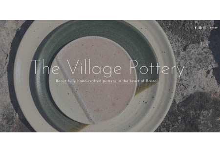
The first page you see would be a slideshow of beautiful images or their work, and then you will have to click enter or in the middle of the page to get to the content page. I like the white space between each piece of information as it is easier to read all the information because it makes me feel calm. Also, from all the options they have on the menu, they decided to display three main links for the first part of the main page: sets and gifts, the blog, and lesson info, because these are the most popular choices among the customers. Then they have three more sections: Newsletter, Reviews, and Instagram (this is their main social media platform).
Also, their menu is well organized, their photographs display their products very well and they take every image on their website as an opportunity to promote their products.