There are different methods to choose a great colour scheme for a website including brand based and rooted in content. Below you will find three examples of different animal charity websites that have used specific colours to represent different feelings.
RSPCA
Royal Society for the Prevention of Cruelty to Animals (RSPCA), they work to improve the welfare of pets, farm animals, wild animals, every kind of animal. They are one of the largest and oldest animal welfare organisation in the planet.
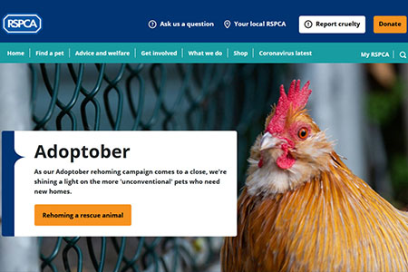
RSPCS’s colour scheme is mainly bases on the colour blue, as we can see below.
Being one of the oldest organisation, they have to take that as an advantage, this is why the main reason they use blue is to show stability, expertise and therefore reliability.
They also use hints of orange to highlight important actions. We can see in the picture above how “Donate”, and “Rehoming a rescue animal” have the same tone of orange as the animal that is included in the picture, showing that any of the following actions will benefit, somehow, innocent animals like the chicken.
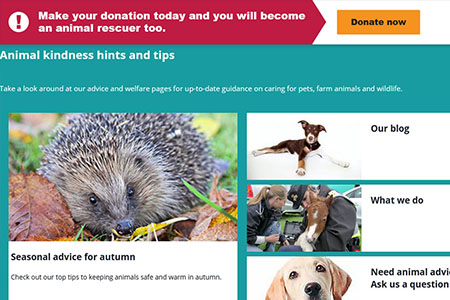
They also use a different tone of blue, a lighter one, that is a bit more friendly, in this case to talk about guidance on caring for pets. This tone of blue is very convenient when you want to express calmness.
Also, they use red for the arrow that is pointing to the “Donate Now” link, in order to draw the atention of the user to it and to express urgency as well.
WoodGreen
WoodGreen, the animals charity, is a pet charity. They provide care for pets in need and for the owners as well, so pet owners can have a happy relationship with their pets.
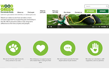
The main colour they use is green. Green is a colour that represents new beginnings and hope, something that it is expected for their animals and the community. They use grey as their background colour as it is a formal colour, letting the green being the point of focus.
The menu of the website is completely white and uses black as their font colour, but the “Sponsor” and “Donate” buttoms use the same colour as the logo, meaning that these two actions are the most important ones that a user could do while visiting their website.
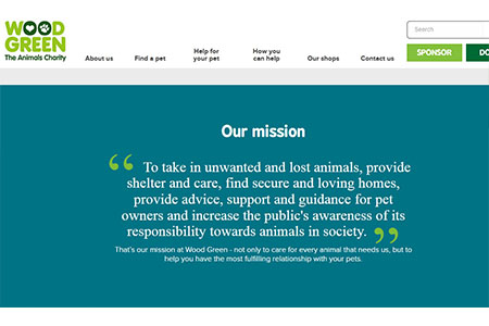
They have some sections in blue, for example, their mission statement, as this colour gives a trustworthy feeling to the user. Also, a bit of green on blue is a nice colour combination.
WWF
The primary focus of World Wildlife Fund (WWF) is to conserve, preserve and restore natural environments around the world. Their black and white panda logo has been used since 1961, and they have used these colours as their brand, therefore their website colour scheme is brand based as shown on the image below.
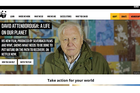
They use a white background, and instead of having section with different plain colours, like we saw in the precious examples, they use photographs to show emotions and to persuade people to take action.
Some of the few other colours I could see was the yellow, orange and red in the right corner of the menu, this is used to draw the attention of the user to that point so the user can remember that they can donate, adopt or become a member in order to help their planet.
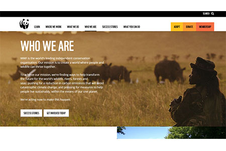
As mentioned before, they use images to compliment their messages instead of just plain colours, for example, the photography they use as a background for the “Who we are” text, has various tones and shades of brown, giving the text the earthiness nad warmth feeling, which is exactly what they want the want the user to feel like when reading about them.